AI Translation @OneDrive
Timeline
1 Month (Jan. - Feb. 2025)
Platforms
Web & Mobile
Collaborators
1 Design mentor
4 Developers(2 web, 2 mobile), 2 PMs
My role
Led and executed in-context translation design for web and mobile with AI integration. Collaborated with PMs, engineers, and researchers to prototype, test, and refine solutions preserving formatting and workflow.
This project brought the PDF translation feature in OneDrive, enabling users to translate selected text seamlessly within documents. By focusing on contextual accuracy and smooth AI integration with Copilot, we created an intuitive, inline translation experience that preserves formatting and tone, helping users stay focused and confident while reading.
THE PROBLEM
Most translation results are out of context and breaks user reading flow
When users want to translate specific paragraphs within a PDF document into another language, they seek nuanced translations that preserve the original meaning and tone for better understanding.
DESIGN GOAL
Ensures a smooth, contextual translation that helps the user stay focused on the content without disrupting their reading experience.
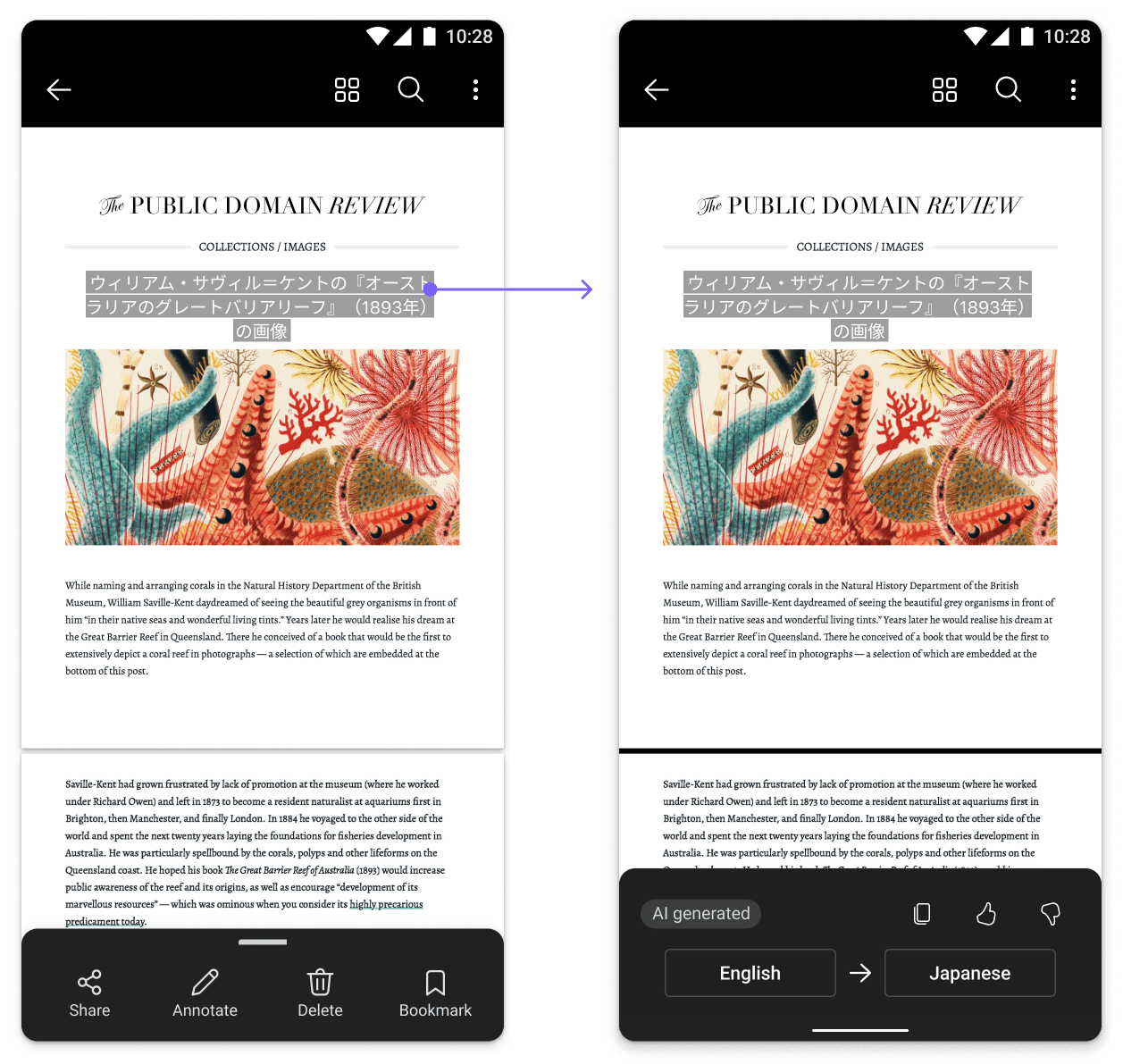
Consistent layout for seamless reading
Translations appear dynamically within the existing content so users never leave their workflow. Context-aware algorithms retain formatting, tone, and layout to avoid visual disruption.
Contextual aware translation outcome
Leverage document themes, user behavior, and domain-specific terminology to deliver translations that match the content’s intent and subject matter.
Highlighted AI design treatment to signal quality
Seamlessly integrate awareness of Copilot’s role into the translation experience, ensuring users intuitively recognize AI contributions without disrupting focus or workflow continuity.
Deliverables
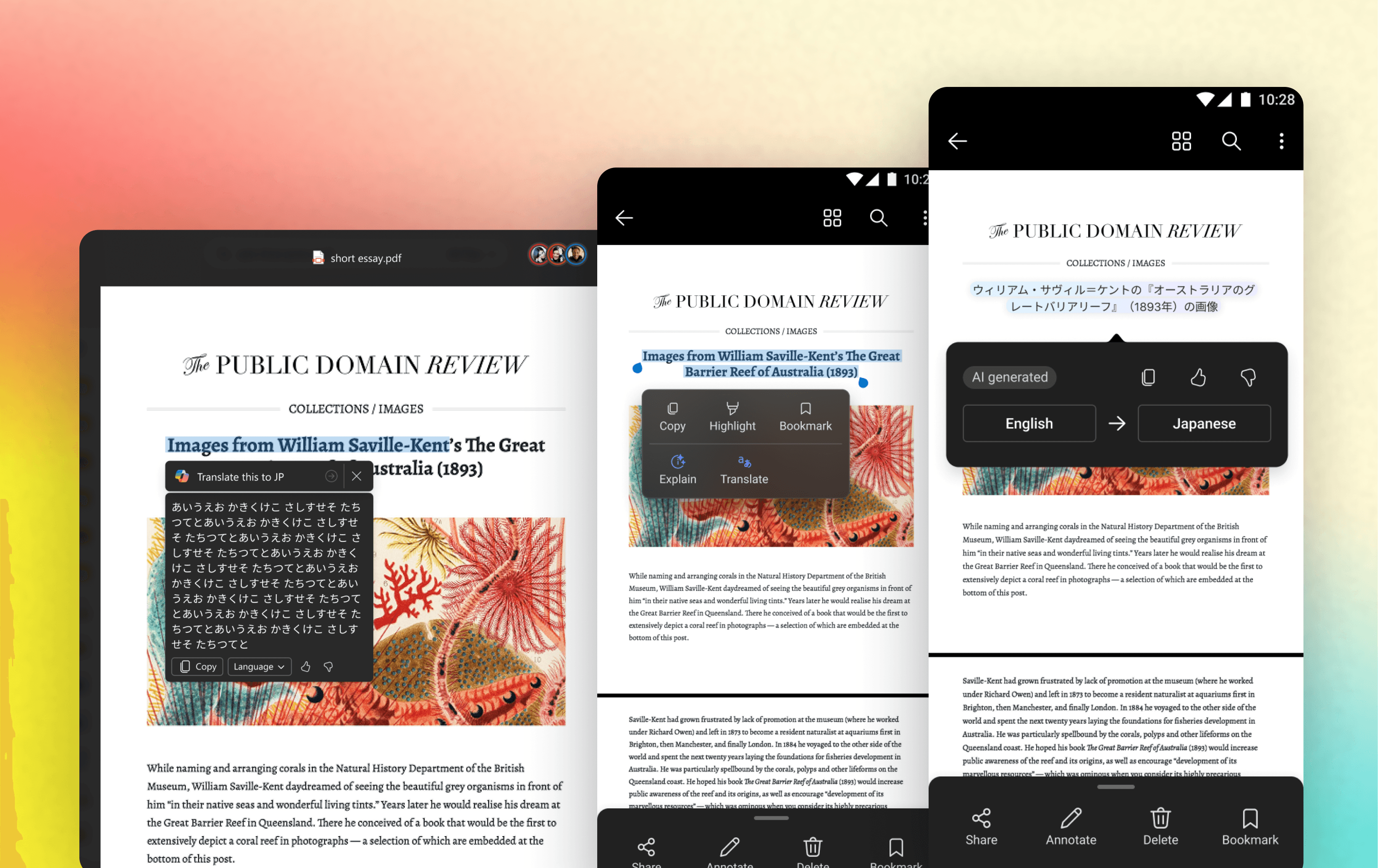
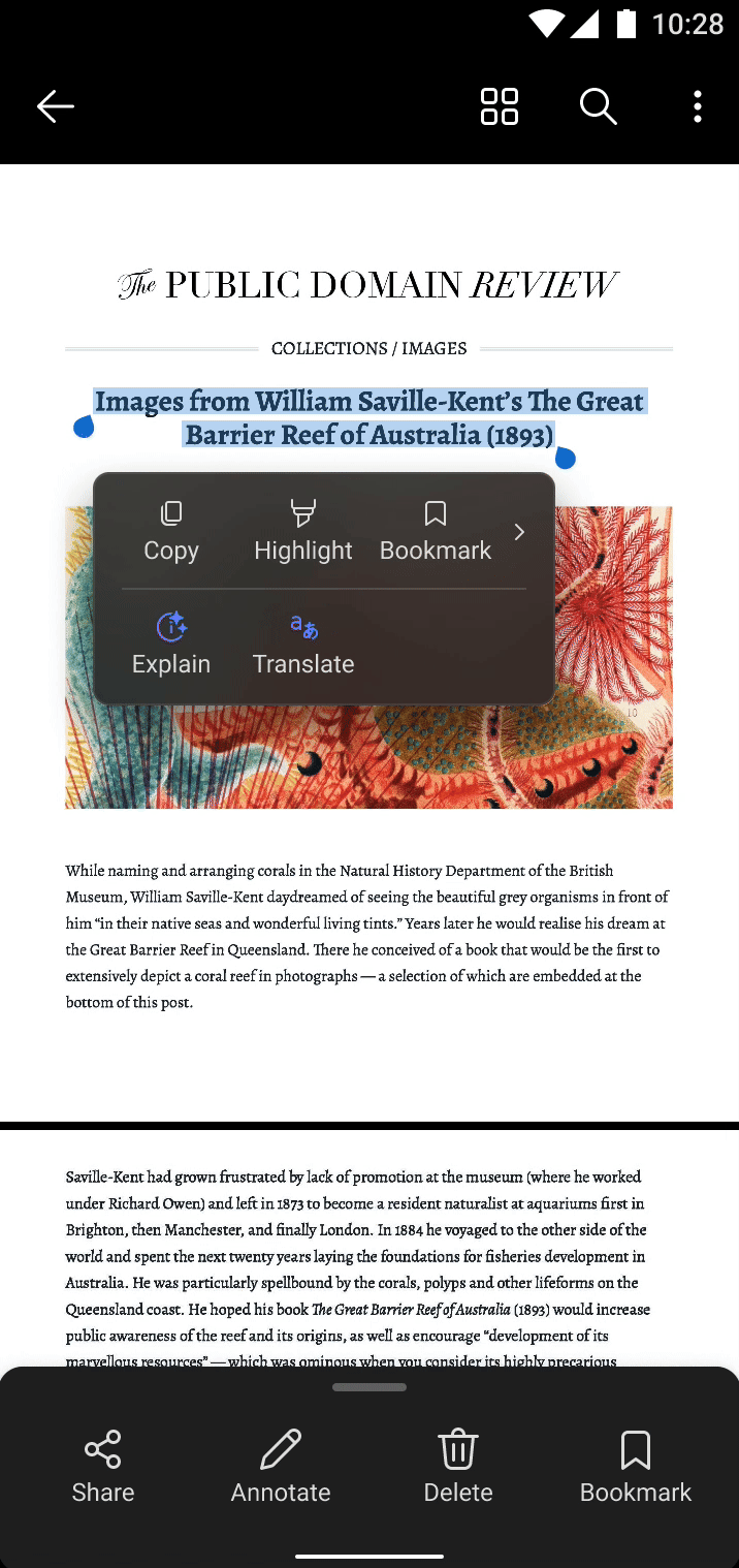
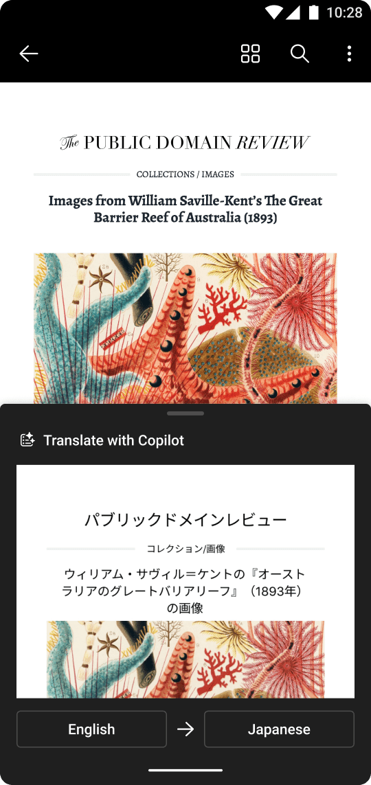
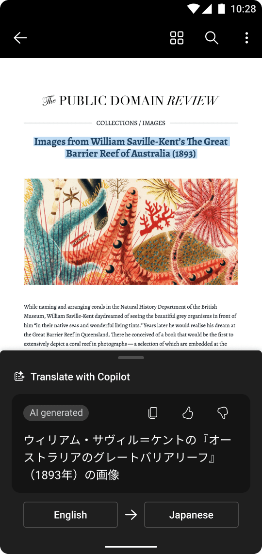
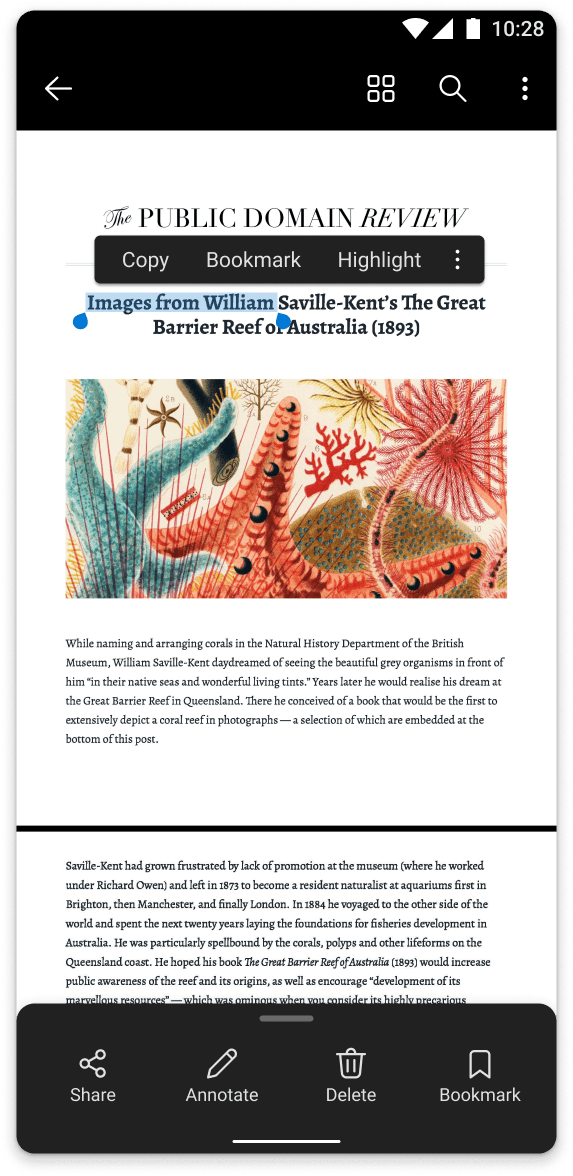
In-canvas translation
When users select text in a document, a contextual menu appears. Upon clicking “Translate,” a colored overlay is displayed directly over the original text.

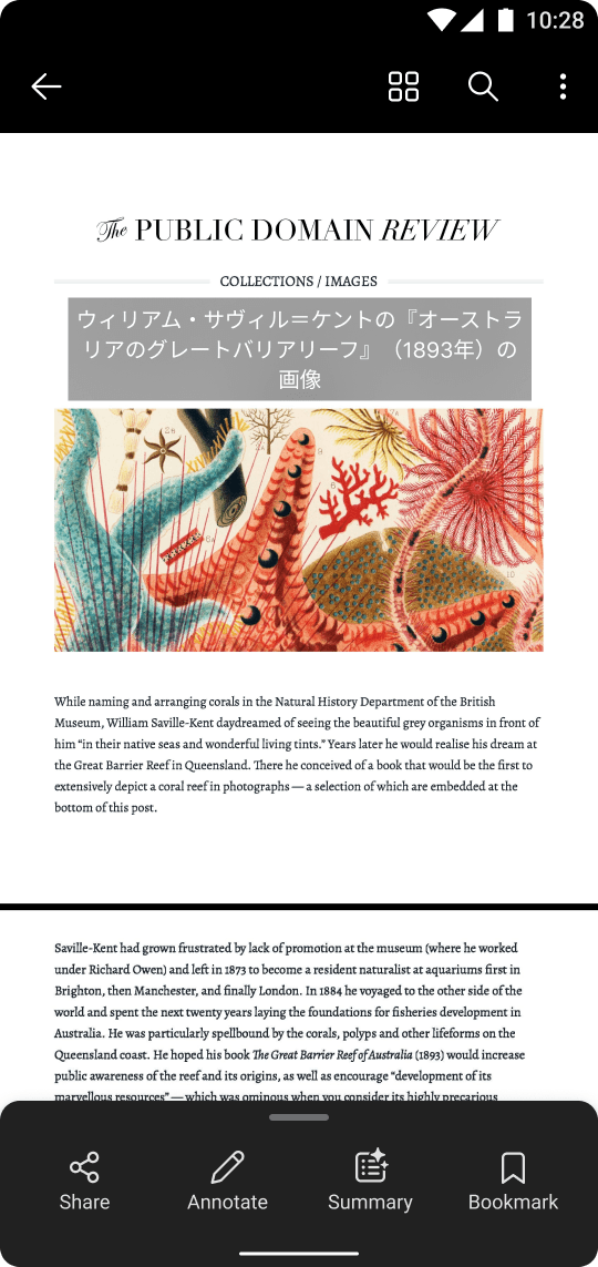
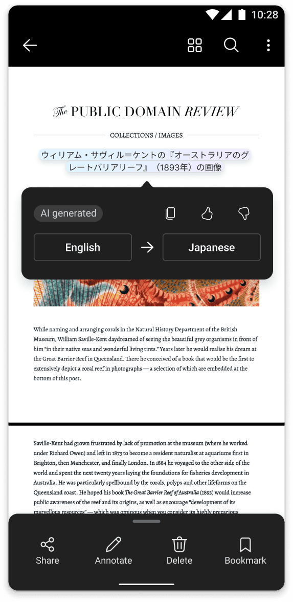
Language switching
When users want to switch languages, they can tap the translated text to reveal a settings menu positioned just below it. From there, they can copy the translation, provide AI feedback, or select a different language. Tapping outside the menu dismisses it.
Design Solution Exploration
Reimagine a better translation experience in PDF
Design considerations 1: Competitor Analysis

We benchmarked 12+ tools and identified two flawed patterns:
1. Switching to a new page or triggering a translation popup
→ Breaks reading flow and interrupts focus.
2. Over-Engineered UI (e.g., multi-step floating toolbars)
→ Adds cognitive load, distracts from content.
Design considerations 2: How might we let users get the translation they need without interrupting the reading experience
In-line overlay
✅ Pros
Doesn’t interrupt the reading experience
Provides a clean, minimal visual overlay
❌ Cons
Can’t compare the original text and translated text side by side
Side panel (file)
✅ Pros
Allows easy comparison of the original text and translated text
❌ Cons
Slightly disrupts the natural reading flow
Side panel (text)
✅ Pros
Allows easy comparison of the original text and translated text
❌ Cons
Slightly disrupts the natural reading flow
Floating tooltip

✅ Pros
Allows easy comparison of the original text and translated text
❌ Cons
Feels visually heavy and can be distracting for users
💡 Why choose in-line overlay?
During user testing, both the in-line overlay and file-level side panel received the most positive feedback. The in-line overlay interaction doesn’t disrupt the user’s reading experience, but one potential downside is that users can’t view the original text on the same page. The side panel allows users to view the translation and the original text side by side, but developing this option would require significant engineering effort. To balance user experience and development efficiency—and to ensure a smooth, uninterrupted reading experience—we ultimately chose the in-line overlay approach.
Design considerations 3: What if I want to switch language?
Floating menu

✅ Pros
Enables easy comparison of the original and translated text
Offers a lightweight and non-intrusive visual experience
❌ Cons
May overlap or cover parts of the content, impacting readability
Bottom sheet
✅ Pros
Provides a seamless language-switching experience
Maintains a light visual footprint, allowing users to focus on content
❌ Cons
Users can’t compare the original text and translated text side by side
💡 Why choose floating menu?
The floating menu is positioned closer to the translated text, so the action path is shorter for the user. Although it may block part of the content, since the user's main task at this point is to switch languages, we prioritized language switching in the design.
Design considerations 4: Amplify AI integration
Add gradient

Before
After
Use gradient colors to emphasize the revolutionary accuracy of AI-generated translations, helping users easily recognize translation improvements.
Dual-menu
Before
After
The single-level menu was space-limited. We separated features into two levels: one for quick access, and one for highlighting key features with gradient colors to enhance AI awareness.
🤩 My Proudest Moment